Notes on this essay: Gerard Unger passed away in 2018 and, with him, a powerful vision about type design, typography, reading, and legibility. Happily, his typefaces, his words, and his teachings remain. Before his passing, Gerard designed new typefaces, Alverata and Sanserata, both available for licensing through TypeTogether, an outstanding digital type foundry led by his former students, Veronika Burian and José Scaglione. Gerard’s Coranto 2 and Capitolium 2 fonts may also be viewed and licensed through the foundry. He also completed significant updates to his elder Demos and Praxis families, both of which are available at FontShop. An educator through and through, Gerard also wrote his final book, Theory of Type Design.
The OurType foundry closed down in 2017. A digital and analog craftsman of the highest order, Fred Smeijers has designed exceptional typefaces that may now be licensed via TYPE BY, a new ‘label’ owned and managed by him and Corina Cotorobai. His earlier type designs, the majority of which have been enhanced, may also be viewed and licensed through the site. Also an educator, the second edition of Fred’s book, Counterpunch: Making Type in the Sixteenth Century, Designing Typefaces Now, already translated into several languages (and now out-of-print), is a testament to his unwavering dedication to the crafts of type founding and type design.
Finally, though the community I now serve as a professor is far from the ocean and closer to a major cultural center, there seems a great deal more that stands in the way of preparing undergraduates for a meaningful higher education by way of design, a great deal more that stands in the way of establishing a culture of design in and beyond the classroom. I ascribe this, in part, to the ballooning costs of a higher education in the US, which has led to aggressive competition among public and private universities. Lured by institutional catchphrases, the American public expects a return on investment, they expect universities to provide acreage, technology, educational and recreational facilities; leadership, creativity, professionalism, and so on. In reality, the former things are beside the point and, the latter, are hard-won by the most dedicated and intrepid of students.
What does it take to become a genuine student of a subject? What makes a professional? This essay was written with these and other questions in mind. It was originally published by AIGA, the professional organization for design, in 2005.
I write this well aware of my circumstances: that I am a design professor living and working in a community edged by the ocean and somewhat isolated from major cultural centers; that I am mentoring design hopefuls during a time of social and economic uncertainty; that this uncertainty leads my students to feel unsure of themselves and of their futures. The pessimist in me is surprised that anyone should care to take up design when the field is more saturated than ever, when public interest has narrowed to simply making ends meet. Is it possible to develop a progressive design pedagogy when, understandably, what my students and their families desire – almost to the exclusion of acquiring broad-based knowledge – is the assurance of a job after college? Can we inspire a professional and humanitarian commitment among students, let alone a sense of purpose?
This rumination is precipitated by what I have observed time and again: with the exception of a very few, my students regard design as a mere vocation not, as has often been cited, an interdisciplinary and highly edifying venture. Is their foreshortened outlook just a lack of ambition? a lack of maturity? are they just banking on a direction to be set for them? Whatever the case, the chasm seems improbable considering that we, now more than ever, live in an image-saturated, image conscious and ‘branded’ world. Student obliviousness to the profession’s potency is alarming. Despite their professed dedication to design, and their experience of design in high school, very few students actually know what it is. Many are incognizant of the fact that by choosing design as a major, they incidentally become part of the profession’s rich history and are responsible for taking a stance within the continuum by developing and maintaining high standards of practice – that, as initiates and emissaries of the profession, they are obliged to strive for excellence.
I acknowledge that the pre-existing culture in my community determines the character of students in our program. Like many professors, I live and work in a region with a unique population whose personal histories shape their values, ambitions, and perception of the world. I acknowledge that the degrees to which students embrace design is absolutely dependent on their personal histories. Having met a fair share of prospective students and their families, it is clear that design is misunderstood. Interestingly, there have not been, to my recollection, any inquiries as to what, other than artistic inclination, is required of a design student. The parental line of questioning suggests an awareness of a pre-defined system for which their child must be made ready, no more and no less. Hence, the ever-present quintet of queries: ‘What kinds of design jobs are there?’ (Because a higher education is about employment?) ‘How many courses outside the major does my child need to take?’ (Because general education courses are beside the point?) ‘When will they be taking design courses?’ (Because the sooner they take courses ‘that count’, the better?) followed by ‘How many? (???) and ‘Can they finish in four years?’ (Because college is costly.) Faculty are left with the somewhat disingenuous exercise of assuring prospective students and their families that they will have a fulfilling career in design – that, regardless of skill and aptitude, their hopeful will be made fit for the field. But, is success not based on initiative? – what a student is willing to make of the discipline, what s/he is willing to discover for and about her/himself in and beyond the classroom? There remains an emphasis to grow a larger and larger body of design majors with little regard for what new recruits themselves will contribute (other than a hazy interest in design).
The persistent ballooning of graphic design programs nationwide affirms that we are everywhere and nowhere. It is time we exchanged the practice of assurance for one of challenge because students should not only commit to designing well, they should do so with the utmost dedication, sincerity, and vitality. Education is not the business of solely producing fit-for market graphic designers. We must stop the practice of indiscriminate field deference for curricular and pedagogical endorsement and focus instead on innovation, which is an outcome of personal commitment. How else are we to steer students toward a port of call?
Willing it so
I am as drawn to the historical aspects of typography as I am to its application. While the history of typography is essential grounding for my students, I make an effort to avoid historicism and habit because synthesis and interpretation, not mere regurgitation of the past, are my goals. Recently, I began to think about what, in essence, a commitment to letterforms truly signifies? What knowledge, apart from recognizing structural differences and similarities, might students gain from observing the shapes of letters? What message(s) might be discerned from these discreet yet highly systematized carriers of meaning comprised of curves, joints, and tapers? These nuances facilitate classification, they are the criteria used to assess a typeface’s appropriateness and they are the means by which students learn the methods of their production. However, I am especially interested in conveying, by way of typographic practice, a set of values to my students through the shapes of letterforms themselves. I ask, and attempt to answer the following questions through my teaching:
· To what degree is humanism ensconced in typefaces? (I use ‘humanism’ here to mean a commitment to learning with an eye towards the betterment of humanity through a personal contribution. I therefore extend my use of the term to include ‘humanitarian’.)
· How does a type designer convey humanism while imbuing a typeface with practical value?
· What do typefaces ‘say’ about their makers?
· What principles guide a type designer’s actions?
Typography is not a highly regarded enterprise among students, which always makes it a challenge to teach. Student aversion to reading, research, and writing (‘That’s why we’re art majors!’) and their eagerness to work with software far outweigh their willingness to adopt the studious and rigorous attitude that has shaped much of typographic history and continues to inform its application today. Student success partially depends upon reviving and sustaining the culture of learning that is essential to the practice and appreciation of typography. The usual smattering of artifacts through slide shows, web sites, and the perusal of pages from design picture books (type annuals, trade magazines, best ofs, etc.) while essential to the illumination of contemporary methods, stunt intellectual growth by their singular emphasis on appearance. This dilutive approach often focuses on commercial good looks arrived at in the seeming absence of process and critical dialogue – the former guided by personal values, politics, religion, orientation; the latter a means to question or reinforce motivations.
If appearance is emphasized and goodness of fit is not evaluated, student work assumes a clinical officiousness that, ironically, celebrates the absence of humanism and the blind acceptance of the terms and conditions of design production. Because salability and technical mastery have eclipsed creativity, broad-based knowledge, and discourse, I am moved to address typography as a projection of self. To discuss it as something of the student’s as opposed to an ‘other’ whose process and vocabulary must, out of necessity, be painstakingly learned in a few short semesters. When letters, and the things one does with them, are perceived as linked to one’s sense of identity, then the stakes are raised considerably. And, while the notion of a highly charged and personal typography might sound impractical (or moralizing), there are outstanding models to which we can refer.
My intention is to establish, perhaps forcibly, a connection between typography and the cultivation of a strong personal character among students.
Strong and big-boned
The permissive culture in the Netherlands and its generous patronage of progressive design is well documented in Jan Middendorp’s 2004 opus, Dutch Type. It is a phenomenon that such a small European country continues to leave an irrefutable impression upon the landscape of graphic and typographic design. It would seem that the Dutch have achieved, and are indeed living in, a climate that propagates and upholds design as a culturally pertinent practice. Of great interest to me is the existence of an almost palpable concept among Dutch type designers of what constitutes their letters. If there is a national character to be ascertained from letters made in the Netherlands, it is undoubtedly in the bones.
Dutch letterforms are startling. The American printing scholar, Daniel Berkely Updike, writing on the types possibly cut by Christoffel van Dijck for Elzevir’s renowned 32mo pocket books, is unable to conceal his disdain. He describes such letters en mass as ‘rugged little types’ that are ‘not so good’.1 Despite which the ascendance of this genre from the cinquecento onward gave rise to an intrepid, novel aesthetic that fuels the creation of a steadily multiplying class of charming, nearly indestructible typefaces possessed of an incontrovertibly strong character on par with established French letters of the period (Granjon and Garamond notably). The disposition of Dutch type owes much to Ameet Tavernier and Hendrik van den Keere (aka, Henri du Tour). With his two-line Pica Roman, Tavernier offered in metal an unapologetic, rough and dark typeface replete with much taller lowercase letters. Van den Keere followed with more refined yet equally dark Two-Line Double Pica and Paragon Romans (also with considerably tall lowercase letters), thereby solidifying what has become a distinctly Dutch conception. This sort of lettering is absolutely naturalized in the typefounding practices of Dirk Voskens, Miklow Kís, Johann Michael Fleischmann, and Jacques-François Rosart.
It was remarkable to see the same mid-sixteenth century character in the digital type designs of Gerard Unger and Fred Smeijers. While both men harbor a deep respect for tradition, each manages to avoid the pitfall of blind adherence to tradition. Both exhibit an uncompromising degree of individuality as they address functional and aesthetic needs. With the utmost care for details, Unger and Smeijers extend the realm of possibilities central to the articulation of typefaces, whether their designs are commissioned or self-initiated. Stellar type designers abound in the Netherlands, so I am obliged to explain my affection for the work of these two men.
Prior to completing my undergraduate degree, I became captivated by letterforms. I became aware of their ubiquity and of their magical ability to convey the ineffable – a mood, an attitude, a historical moment or event. I was attracted to the sobriety and inherent abstractness of typography; I sensed there was something learned in typesetting and type design, something connected to history and knowledge, which made the discipline all the more interesting. There is a narrative to Unger and Smeijers letters that continues to attract my attention, kernels of inspiration, principles of design, told lyrically through the ebb and flow of details that mark their oeuvres.
I learned of Gerard Unger in my second year of college after reading his article in Émigré 23 titled ‘Legible?’ (published in 1992, reprinted in Émigré 65). I was absolutely taken by his meditation on the subject of legibility. To my surprise, Unger (then 50) eschewed the partisan mantra of typographic invisibility by citing emotion and passion in lieu of the dogmatic and nearly exasperating abstinence of Stanley Morison and Beatrice Warde, the latter famous for correlating the practice of typography to a crystal goblet, the former for supervising the design of Times Roman, his contributions as a type historian and for his religious resistance to sanserif typefaces. Both Morison and Warde advocated an essentially invisible, depersonalized typography. Unger’s writing is noteworthy as it sets the groundwork for a bustling, vibrant typography that contrasts with Morison and Warde’s dictums. His writing diminishes the utilitarian, machine-like frigidity that renders typefaces literally characterless for a warm, open-mindedness, which can be found in his own type designs. His prose reminds us that typefaces must be read and understood by ordinary readers but that in order to achieve this, one need not adopt an ascetic stance. This is an argument made all the more convincing by Unger’s practical experience.
It was not until 1994 when I received a copy of Dutch graphic design: A century set in Unger’s best-selling Swift, that I was introduced to his typefaces and began to notice them dot the landscape. Educated at the Rietveld Academy and inspired by the renowned type designer and lettering artist, Jan van Krimpen, Unger has a repertoire of 21 type designs, including updates to his Demos and Swift, letterforms that are as powerful as their mid-sixteenth century antecedents. Unger is a consummate problem-solver whose first typeface design dubbed Markeur (1972), for Enschedé (the famous, 300-year-old printing and type manufacturing firm based in Haarlem), was developed to survive its transfer from paper onto laminated plastic surfaces used for signage. The stems of the letters, comparable to humanist sanserifs like Herman Zapf’s Optima, are drawn to slightly flare out to reduce the effects of the rotating bit used for engraving. The result was a rounded, legible sanserif that paved the way for later designs.
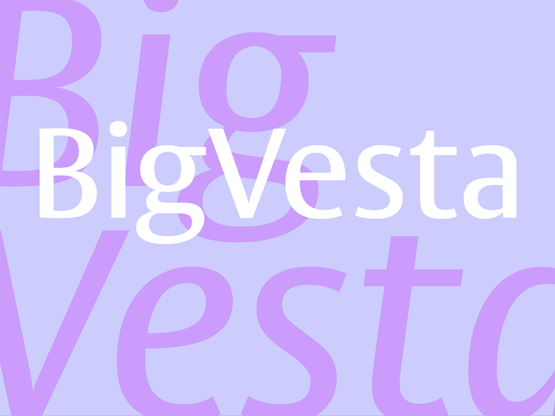
It is perhaps best to speak of Unger by way of two typefaces: Swift and BigVesta, the former released in 1985 and re-released with enhancements as ‘Swift 2.0’ in 1995, the latter a titling version of his earlier Vesta issued in 2003. More than any of his typefaces, these two represent a median of effects that describe his methods. Fred Smeijers2 states that Unger’s letters are ‘Calvinistic’ and, though I am not entirely clear as to the term’s significance, I am inclined to think that if it indeed concerns predestination, it is not God’s will but Unger’s that ensures the survival of his letterforms in a variety of conditions.
Swift, conceived by Unger after he determined that ‘the market could use’ such a typeface3, is principally designed to stand up to the severe realm of newspaper printing, though better papers and presses these days and its sure-fire features have allowed it to live a life in the more cultivated pages of catalogues, magazines, and annual reports. Its appeal, now an Unger stamp, is its warm and crisp surety of self and as such, its unyielding features include a dark color, open counters, short ascenders and descenders, wedge serifs and anvil-shaped terminals (particularly the flags of lowercase a, c, f, and r). Its accompanying italic, unlike the italics of the Renaissance, Baroque, Neoclassical, and Modern genres – anemic if not for their gracefulness – does not surrender these features. Like their upright brethren, Swift italic is undeniable.
Unger’s BigVesta is a typeface accoutered with an exaggeratedly tall x-height which makes it one of the more astonishing in his anthology. It is a humanist sanserif titling face, ‘the Vesta variation for newspapers’4 and, though Unger recommends it be used with a selection of his seriffed faces, BigVesta works admirably for running text, ‘the surprise was that BigVesta also works well in small sizes in newspaper columns. We went down to 7.5 point and still the letters looked very big. So in the end, 7 point was applied … with much satisfaction.’5 Like Swift, BigVesta embodies Unger’s concern for legibility and economy; his drawings tend toward the somewhat condensed but with spacious apertures that allow more characters per line. Text set in BigVesta exhibits a degree of monumentality uncommon to other humanist sanserifs; like soldiers at the ready. The family maintains a squarish proportion; it is dark, apprehensible and amicable. Essential to BigVesta’s appeal is the fact that it excels as a text and headline type.
Among contemporary type designers, Unger’s letters are marked by his presence. Work during the early days of his career addressed the need to design fonts for what then might have been considered primitive typesetting equipment, notably his fifteen-year contract with Dr Ing Rudolf Hell GmbH (now Linotype). Unfortunately, the fonts were for the company’s exclusive use. Consequently, they did not gain the exposure his later fonts received. His typographic expertise made him well suited to address the needs of Océ Nederland and Philips Data Systems.6 Since then, Unger’s work as a teacher, designers, lecturer and writer (his 1997 book, While you read [Terwijl je leest], relays his thoughts on the inner workings of type design and the ways in which typefaces assist in the process of reading) has solidified his reputation. These activities also became ideal venues to promote his earlier, anonymous typefaces. To peruse Unger’s typefaces, which are outcomes of his personal assessments (Gulliver) or of commissions (Capitolium), is to notice a distinct vision – a unifying palette of structural elements accumulated from his enduring commitment to letters as visual and grammatical forms. As a type designer, his humanism extends far beyond his concern for material and formal economy to include the promulgation of knowledge widely, intelligently, and with character.
Nearly twenty years Unger’s junior, Fred Smeijers is a sensation in design. I encountered his work on the shelf of an uptown Manhattan bookshop until which time I was only glancingly aware of his pursuits, though I knew of his typeface Quadraat. Smeijer’s book, Counterpunch: Making type in the sixteenth century, designing typefaces now, was a serendipitous find – a further indoctrination into the recondite world of typefounding and type design. Smeijers, who is a graduate of the Academy of Fine Arts at Arnhem, exudes a formidable commitment to the practice, which explains his having been awarded the 2001 Gerrit Noordzij Prize for his achievements as a type designer, lettering artist, teacher, and writer. Those four disciplines are evident and seamlessly merged in Counterpunch, which begins with a straightforward description of the differences between writing, lettering, and typography; writing ‘happens when … every … part of the letter is made in one stroke;’ lettering is ‘a step beyond writing … whose … parts are made of more than one stroke’ where there ‘is the much sought-after possibility to reconsider and correct;’7 typography when ‘the composition of the word, as well as the making of the letters, is regulated by machine-fabrication…. [and] can be exactly “specified” … be given to someone else to carry out, and … be repeated exactly …’8 These distinctions set the stage for a thorough discussion of the intricacies of type manufacture in the chapters that follow.
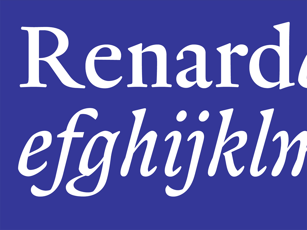
Like Unger, Smeijers lent his skills to Océ who were in need of typographic expertise. His tasks included rasterizing unhinted bitmapped types to generate acceptable images on screen and paper. Interestingly, his need to draw entirely new versions of fonts for different sizes coincided with his research on punchcutting at the Plantin-Moretus Museum. This research, according to Smeijers, was kindled by inquiries from his technician colleagues at Océ. A by-product of his frequent visits to the Museum is Renard, a text type modeled after the Two-Line Double Pica designed by Van den Keere for Christopher Plantin. The typeface remains Smeijers’ most sublime to date, falling squarely within the realm of Dutch lettering: dark, sharp, intelligible, condensed with a large x-height and open counters. Text set in Renard (1996) bears a striking affability and confidence because it is so dark, which explains its contrarian configuration; it is sold by the Enschedé Font Foundry in three weights, appropriately Renard One, Two, and Three – One being the darkest and Three being the lightest. The accompanying small capitals and pi characters in all of the weights more than make up for Renard’s lack of a bold. Renard italic, essentially the result of Smeijers’ conjecture, faithfully emulates pen-written forms. He surmised that Plantin, Van den Keere’s employer, would likely want ‘to emulate the best italic available’9 at the time and determined that an italic by Robert Granjon should be the source. Van den Keere did not draw an italic, a fact that makes Smeijers’ extraordinarily lyrical, hypothetical exercise among the best of its kind. Its inclusion in Renard’s three font families renders the typeface fully serviceable for even the most elaborate typesetting tasks.
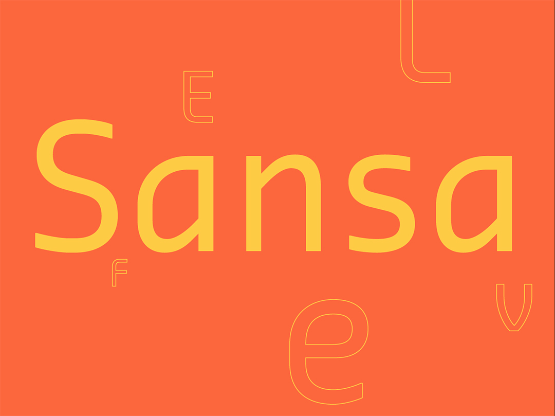
Rudy Geeraerts and Smeijers established the font foundry OurType, based in De Pinte, Belgium, in 2002. The business is a new platform from which Smeijers and his partners (now including his wife, Corina Cotorobai) can develop and distribute digital fonts with more latitude. Smeijers’ varied interests as a type designer have led to a highly functional cache of types for a range of uses. Sansa, one of the four retail typefaces first made available by OurType, is a plainspoken yet resplendent ‘non-literary’ face that is quite contemporary. Surprisingly, Sansa bears the mark of eighteenth-century fabrication, which happily belies its Dutch origins. Though its range is limited by its lack of old style numerals, small capitals, and fractions, Sansa is a practical face. It is capable of addressing daily tasks with enough flair to circumvent the boredom of familiarity. It is neat, brisk, modular, and peppered with surprising features: a cursive (handwritten) mien, open counters, E and L with curved lower strokes, F with a curved upper stroke, convex strokes on Vs and Ws, concave diagonals on Zs and an endearing, smiling e. These characteristics make for unusually legible bold and black weights. Sansa’s italic – really an oblique – bears the brunt of its industrial roots.
Like Unger, Smeijers is an educator, lecturer, writer, practicing designer, and typographer whose expanding portfolio is comprised of commissioned and self-initiated typefaces – he is as comfortable developing fonts for clients as he is charting his own path. Smeijers’ strengths lie in his clearly varied interests, which are bolstered by his respect for typographic tradition. His typefaces consist of revivals (Renard, Romanée, and Nobel, which he designed with Andrea Fuchs), custom work (Philips Cellesse and Philips MPG font), those that are technologically inspired (Brand and Monitor) and those inspired by a personal need (Quadraat). For the past twenty years, Smeijers’ has tendered versatility through an assiduous application and consideration of historical forms and processes. His type designs underscore a personal belief that history illuminates our present and clears a path towards the future.
Sprawling indeterminacy
A defining characteristic of our age is the ironic absence of self-definition. For graphic design and typography in my locale, it is a propensity to avoid claiming too strong a position for fear of being rebuffed or misunderstood. Deference to what are perceived to be field mandates (aka., commercial viability) defines the status quo. My home state of New Jersey exudes the same tentative qualities. Its geographic location and its lack of a center make it ideal for trafficking people, goods, means, and cultures external to it. Overshadowed by Philadelphia and New York, the Garden State seems incapable of generating its own culture of design. Its extensive highway systems, non-stop suburban development; its multitude of expanding strip malls and office complexes give every indication of stately currency, yet the question remains: Who – and what – is New Jersey?
A recent post by Jessica Helfand on Design Observer, titled ‘Method Designing: The Paradox of Modern Design Education’, highlights her concern for the inventive, deeply personal, yet nearly impervious designs generated by students. The problem emanates from the undergraduate tendency to rely on her/his emotions to define and ultimately render a project. Method acting, pioneered by Konstantin Stanislavsky, inspires the ongoing tendency toward a highly individualized process of making. For its efficacy, method acting hinges upon a performer‘s psychology to convincingly portray characters. It would seem as though personal interpretation is the culprit because it engenders a self-centered approach to making, which prevents designed artifacts from living a comprehensible existence. She writes, ‘The persistent evidence of impenetrable personal work in design schools across America is a serious epidemic, resulting in a kind of method designing that erroneously treats sentiment as substance…’.
While I remain appreciative of the underlying modern in Helfand’s prose, my task and my context require just the opposite: I have to encourage a personal approach. While the student work to which Helfand refers already embodies what she describes to be ‘good’ because they necessarily involve problem identification through research and are shepherded by authorship, I continue to combat the stubborn aloofness that de-personalizes my student’s work. A strange, non-committal outlook supersedes personal interpretation in my studios. Our students only marginally practice problem definition, research, and authorship. Their self-imposed hermeticism, which is exacerbated by the now rote ‘you say, I’ll do’ approach, is neither method nor rhetoric. It’s bland and it’s dispassionate. The Modern pursuits of clarity and universality, though hawked by its pioneers as ‘objective’, are the sum of personal perspective – belief in something. ‘Personal’ and ‘interpretation’ are inseparable. My task is to draw out the personal, to encourage students to see its value as the beginning of a complex negotiation that requires merging it with the practical needs of a project. The goal is to make design that is personally gratifying without surrendering its communicative qualities.
To see, to know
There is an aura that surrounds Dutch typography, which escapes explanation even by its most reputable practitioners. Among an assortment of regional factors and historical events, the Dutch style and method is a manifestation of ambition as well as an ability to interpret knowledge, which is always challenged by the circumstances of a period. Unger and Smeijers are unswerving in their respective commitments to form. Their high standards and high regard for history are only matched by their desire to recast tradition, to refer, to question, and to reinvent as appropriate to the success and longevity of their assignments. Their letters are as graceful as they are easily grasped. They speak to us because Unger and Smeijers, first and foremost, know themselves.
1. Updike, Daniel Berkeley. Printing Types: Their History, Forms, and Use (vol 2). New York: Dover Publications, Inc., 1980.
2. Smeijers, Fred. Type now: a manifesto, plus work so far. London: Hyphen Press, 2003.
3. Middendorp, Jan. Dutch Type. Rotterdam: The author/010 Publishers, 2004.
4., 5. E-mail Correspondence with Gerard Unger, March 2004.
6. Middendorp, Jan. Dutch Type. Rotterdam: The author/010 Publishers, 2004.
7., 8., 9. Smeijers, Fred. Counter punch: making type in the sixteenth century, designing typefaces now. London: Hyphen Press, 1996.
Additional sources:
Kinross, Robin. Modern typography: an essay in critical history. London: Hyphen Press, 2004.
Kinross, Robin. Unjustified texts: perspectives on typography. London: Hyphen Press, 2002.
Broos, Kees and Paul Hefting. Dutch graphic design: A century. Massachusetts: The MIT Press, 1993.
‘Gerard Unger,’ John L. Walters, Eye, no. 40, vol. 10, Summer 2001.
‘Legible?’, Gerard Unger, Émigré, no. 65, August 2003.
‘OurType: Niewe letters van/New typefaces by Fred Smeijers,’ Jan Middendorp, Druk, nos 13–14, Late 2002.
‘The Rise of Sprawl: The seemingly never ending expansion into the garden,’ Owen D. Gutfreund, Big. No. 42, May/June 2002.
www.typotheque.com
www.designobserver.com