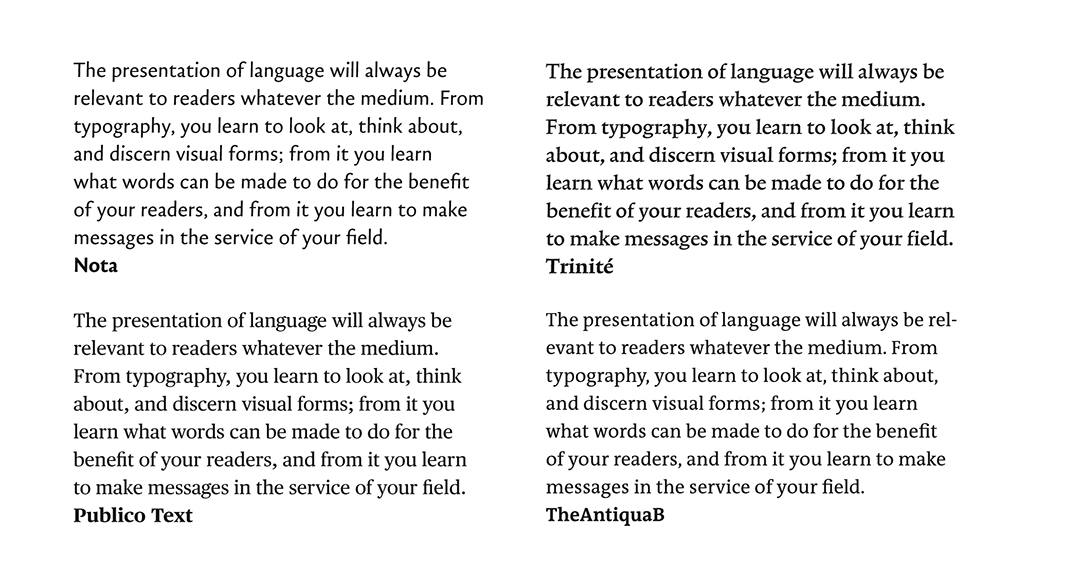
The presentation of language will always be relevant to readers whatever the medium. From typography, you learn to look at, think about, and discern visual forms; from it you learn what words can be made to do for the benefit of readers, and from it you learn to make accessible and visually engaging messages. Good typography relies on your insight into letterforms or, more conventionally, “characters”.
Typefaces and fonts are vital to graphic/visual communication designers. The terms are interchangeable now but, “typeface” traditionally described a family of related letterforms (e.g., Times New Roman Regular, Italic, Bold, and Bold Italic) and “font” described a family member of a certain style and size (e.g., 10-point Times New Roman Italic); both hark back to the days of movable type when letterforms were made and sold as bits of metal. Johannes Gutenberg was the fifteenth century German type founder and printer who mastered the process of casting movable type in the West. He made it possible to generate words and lines of text with reusable letterforms in less time than it would take to handwrite them. He industrialized the reproduction of spoken language which, in time, led to technologies that further simplified writing. Gutenberg’s legacy is apparent to this day: you now live in a time when the production of words can be done at whim by anyone, anywhere, whenever.
Unlike Gutenberg’s letterforms, typefaces today are weightless and infinitely more capable. However, it will take time for you to interpret and evaluate their peculiarities as variants of the alphabet you already know. But, whether or not you have an affinity for words, sensitivity to letterforms is a requisite of graphic/visual communication design. Like it or not, your sensitivity for the way language “sets” and reads is a measure of your competence.
The unhurried discipline of typography seems at odds with the pace and demands of contemporary life. Yet, there are as many typefaces today as there are messages in the world. Whether playful, somber, witty, or provocative, written messages require suitable letterforms, a fact that inspires the creation of new ones and the resurrection of older styles adapted for present-day use. The shapes and character of words, whether printed on paper, projected on a screen, or installed in public spaces, is eminently valuable.
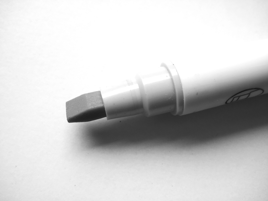
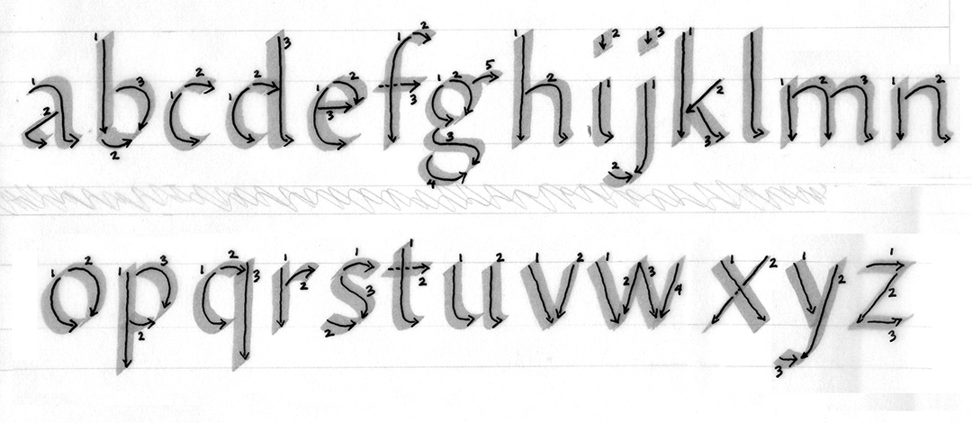
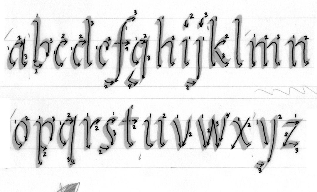
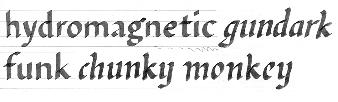
An effective way to unravel letterforms is to write them with a broad nib calligraphy marker. You do not need to be an expert calligrapher to be a good typographer, but the experience of handwriting your own letterforms prepares you to thoughtfully choose and use typefaces. Though it is not the only way to come to grips with typefaces, handwriting explicitly shows the standard to which they adhere. It raises your awareness of penmanship and gives you a better sense of the effort it takes to make relatively consistent, rhythmic shapes. Handwriting enables you to “read” letterforms and it is for these reasons that handwriting is an incomparable teacher.
The words and letterforms you will see here are references. Compare them to the typefaces I discuss and to other typefaces you will, no doubt, come across. If, for just this moment, you are willing to believe that my letterforms represent an ideal, then you can use them to pinpoint idiosyncrasies within units (letterforms/characters) and systems (typefaces or families of fonts). By using disciplined handwriting – mine or your own – as a reference, you will see how the features of a typeface or font are tuned to achieve a certain impression. While handwriting cannot tell you everything, it provides some answers that pertain to a typeface’s origins, strengths, weaknesses, and potential uses. From handwriting, you gain perspective.
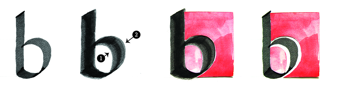
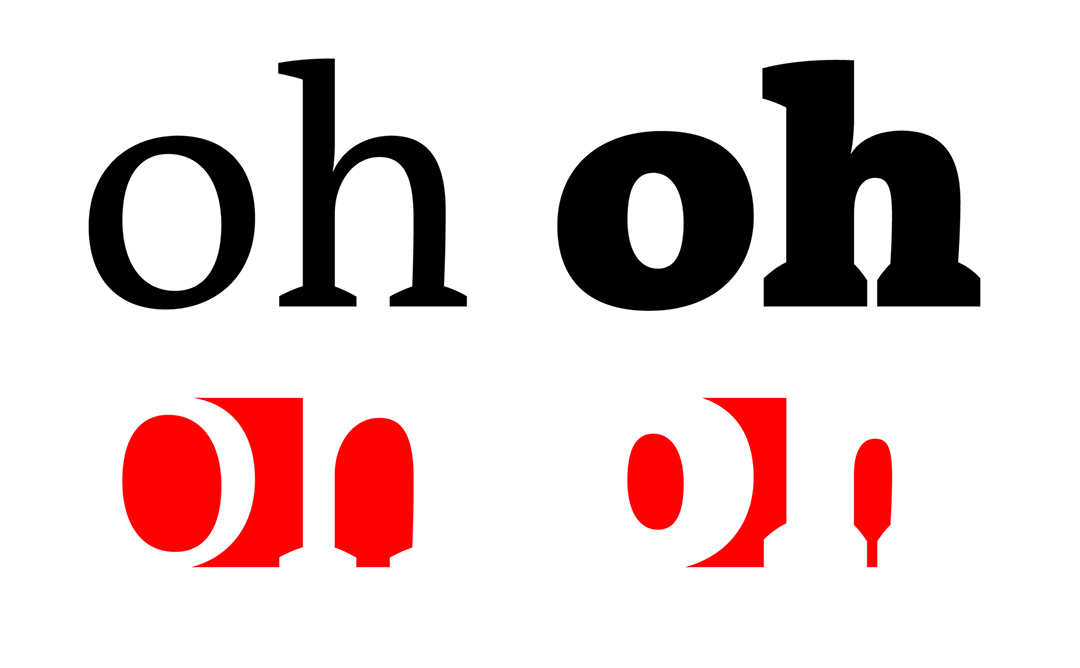
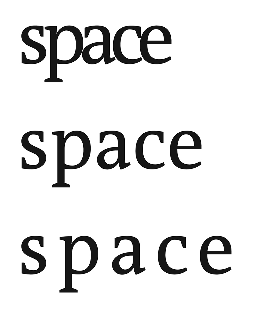
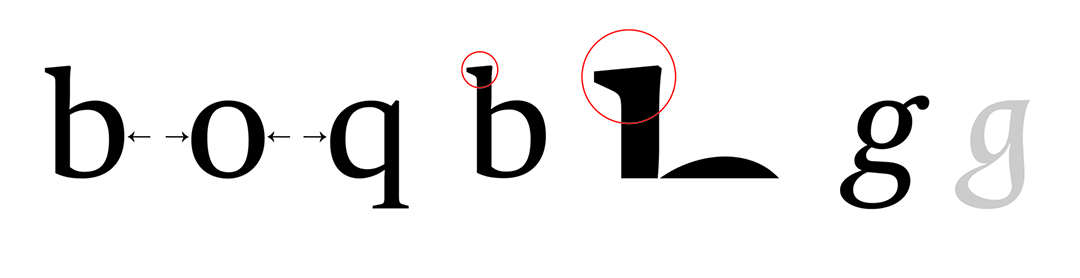
Typefaces allude to handwriting, but they are not handwriting. They are drawings, inventions that exploit and reimagine the upper and lowercase Latin alphabet. Whether they are written or drawn, letterforms consist of variable yet harmonious inner and outer shapes. For example, the difference between regular and bold b is the width of their strokes (black) and the size of their counters (white). To demonstrate, the interior and exterior white shapes of bold b are highlighted red to make them visible. The interior red shape (officially, the counter) creates the curved left edge of b and the exterior red shape creates its corresponding curved right edge. The strokes of b – its curved and straight parts – represent the left and right edges of my calligraphy marker’s broad nib. I cut out the interior and exterior red shapes of bold b and used them to frame regular b. You will see that the strokes of bold b are not only fatter than the strokes of regular b, but that the interior and exterior shapes of bold b are also different. Bold b’s interior is smaller than the interior of regular b; and bold b’s exterior is narrower than regular b’s (this explains the slivers of white you see to the left and right of its belly (officially, its bowl). Letterforms become visible because of the conversation between negative and positive shapes and by the interaction of lines, diagonals, and arcs of a certain orientation, height, width, and curvature. Whether the negative shape is white or highlighted red, when the stroke or positive shape changes, so does the white or negative shape. The two are inseparable.
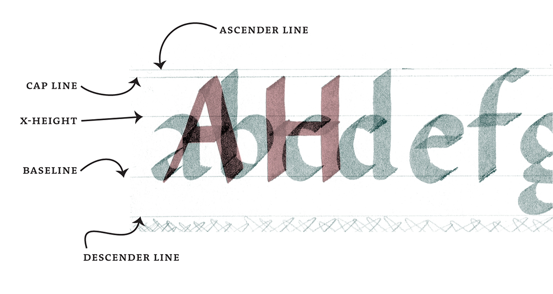
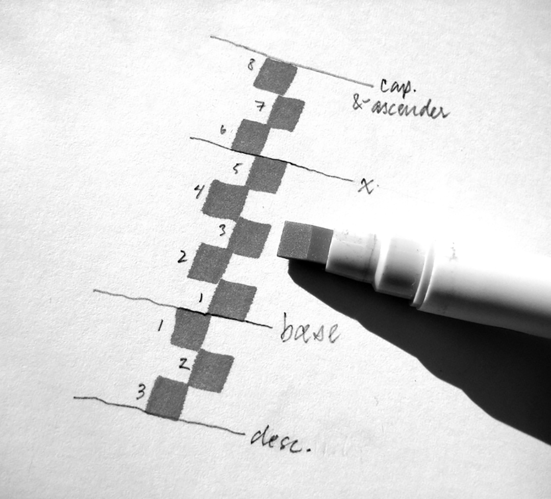
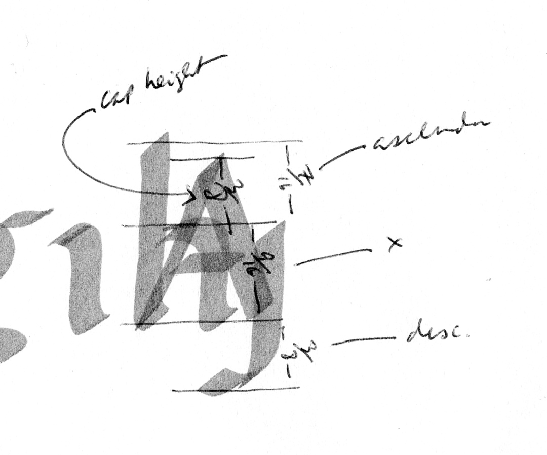
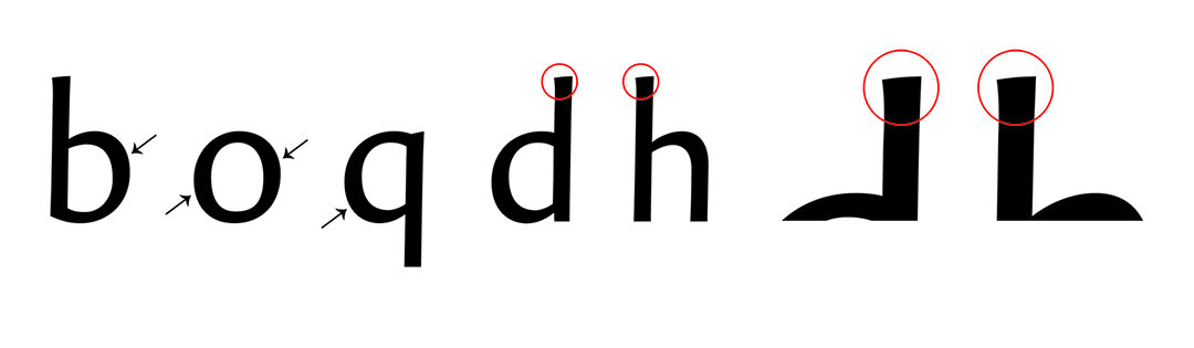
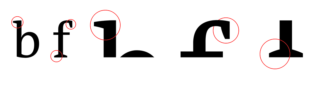
Letterforms are held in place by a series of four parallel guidelines or anchors. Each anchor serves to standardize a letterform’s proportions. The proportions of handwritten letterforms are traditionally based on the width of a pen’s nib. The ratio between x-height and cap height is five blocks to eight and the ratio between x-height, ascenders, and descenders is five blocks to three. Ascenders and descenders are normally the same length and uppercase letterforms, according to the schema, are as tall as ascenders. These, however, are just the ground rules. In actuality, proportions may vary. Aside from specifying and maintaining a “look”, a typeface’s proportions dictate the sizes at which it will perform best and the medium for which it is best suited.
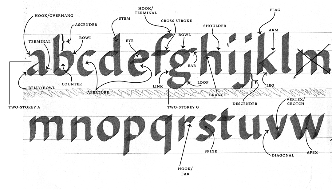
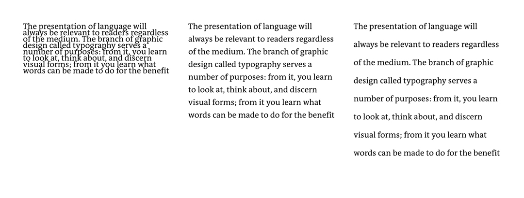
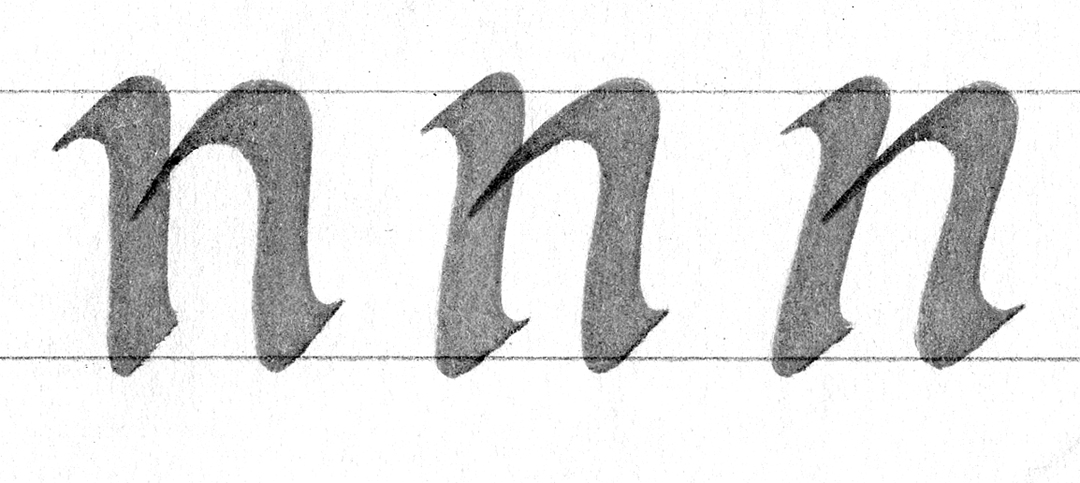
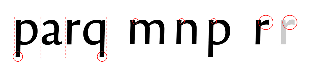
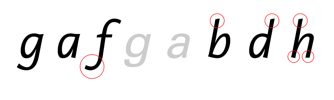
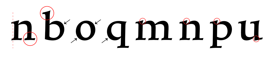
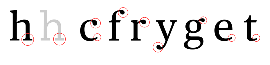
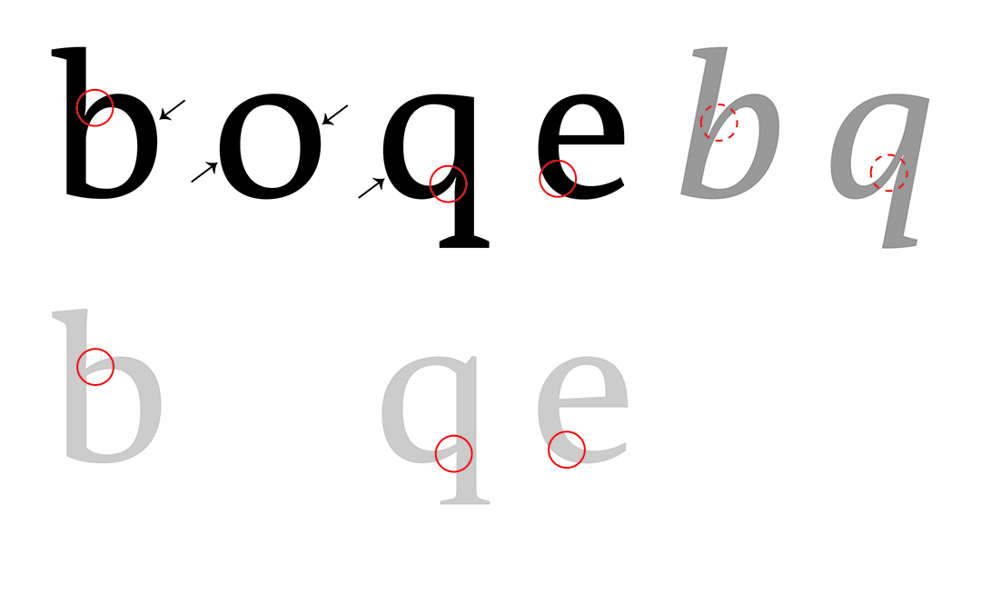
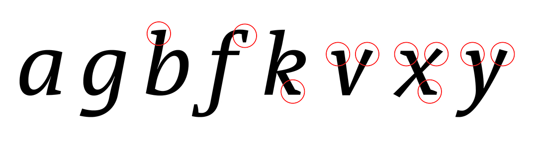
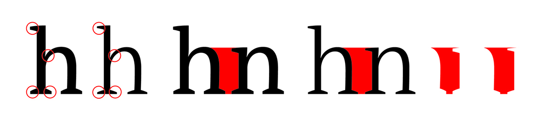
Reading necessitates the continuous flow of words and a word is an accumulation of letterforms. Legibility has a great deal to do with your ability to comfortably read continuous lines of text (as in a novel, an article, or a textbook). This is true whether or not you are able to spot the hallmarks of a letterform: the hook or flag of r, the branch and shoulder of n, the overhang and belly of a, the cross stroke of t, and the enclosed upper counter or eye of e. The features I list must all be written or drawn as clearly as possible to ensure that the characters to which they belong are never misread or confused. If letterforms are legible, then they are readable. Legibility and readability are byproducts of consistency – optical balance. The top and bottom curves of o and the shoulder of n overshoot anchors, and so do the apexes and vertices of letterforms like A and N (not shown here). The spaces inside and between letterforms must look the same: the bolder the letterforms, the smaller their counters (interior shapes), the smaller their counters, the tighter their spacing. Compare the whites of Plain and Black oh, which I show in red. In typography, letterspacing and linespacing are among the variables used by typographers to manage word and line flow. Excessive letterspacing or linespacing makes for words or lines of text that appear disconnected; insufficient letter- or linespacing makes for tightly packed words or lines of text that are hard or uncomfortable to read.
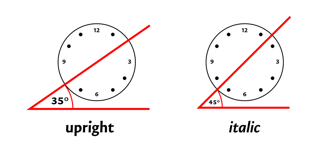
Upright, calligraphic letterforms look as they do because their stresses – where their strokes are thinnest and heaviest – and their rhythms – their specific cadences – come from holding a broad nibbed pen or calligraphy marker at an angle of about 35°. The left and right edges of the nib are positioned at eight o’clock and two o’clock. These positions make for tilted axes and lead to the gentle swelling and tapering of strokes that makes words and lines legible and readable; the angle of 35° creates the illusion of connectedness. There is very little pressure needed to write calligraphic letterforms; it is more important that you maintain the angle of your pen as you write.
Italic letterforms are written with the pen held at an angle of about 45°. The left and right edges of the nib are positioned between seven and eight o’clock and between one and two o’clock, respectively. The sequence, direction, and orientation of strokes are similar to upright or “roman”, with the exception of italic a and g, which become single-storey forms. Italics are narrower, their counters, ascenders and descenders, terminals, ovals, and curved shapes emphasize the style’s looping, rightward bearing. An italic’s degree of slant, contrary to popular belief, is irrelevant: italics can be upright. It is not the slant that makes letterforms italic but, rather, it is in how letterforms are written.
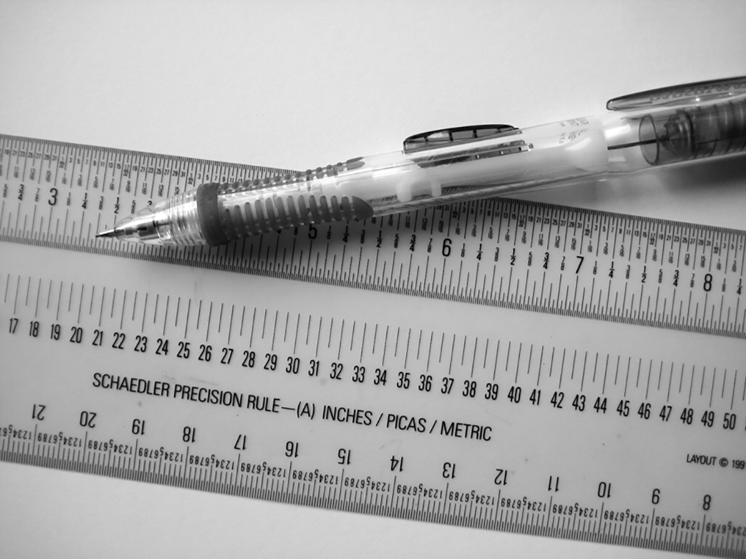
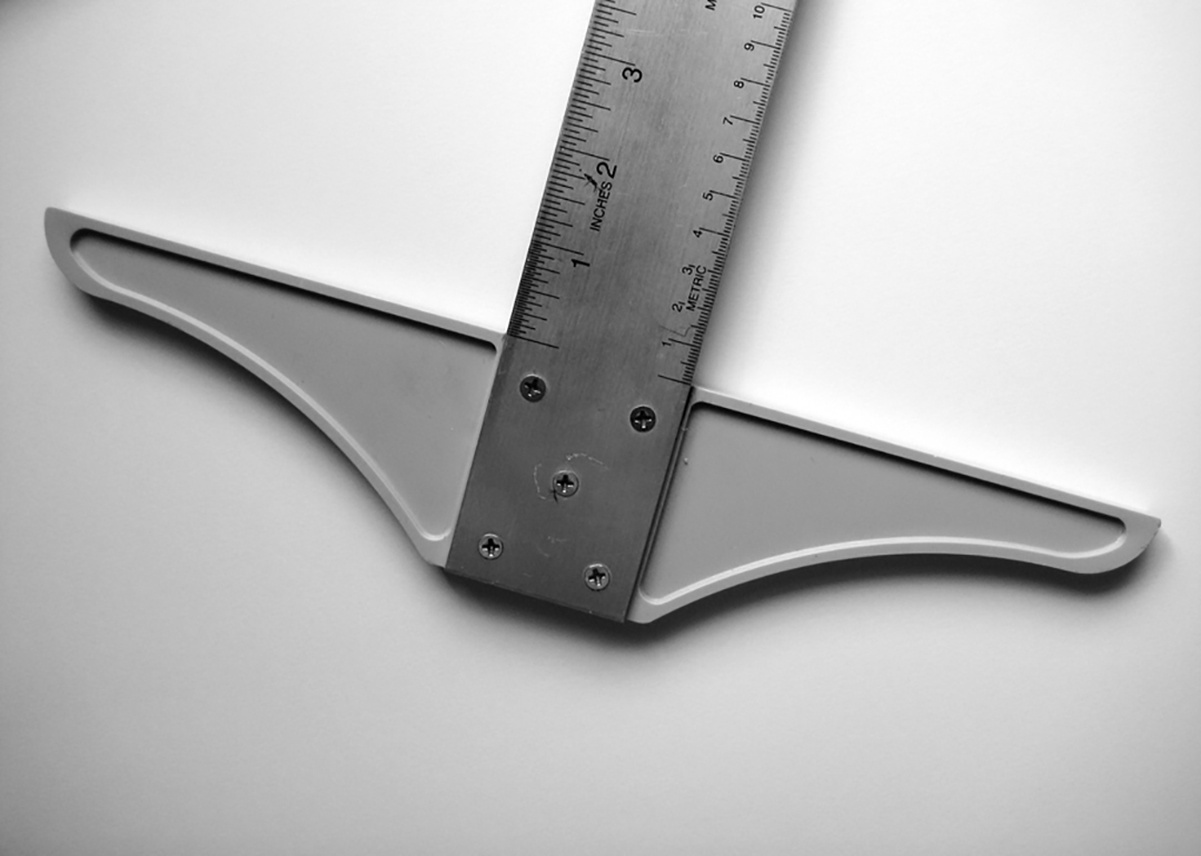
My handwritten letterforms’ proportions were based on what I found to be visually satisfying. I began by loosely writing a, e, o, n, g, h, and j to orient both my pen and my hand and to establish my letterforms’ widths and openings; their x-heights, ascenders, and descenders. Once I achieved what I considered to be the right proportions, I lined and measured the distances between my anchors and used those measurements to make a series of writing templates. Aside from sheets of paper and a broad nib calligraphy marker, the only other tools I used were a mechanical pencil, Schaedler Precision Rule (to gauge the distance between anchor lines), and a t-square (to draw my lines).
My handwriting is original only is so far as it expresses a particular interpretation of calligraphic penmanship. It is distinctive only because it is unlike yours or someone else’s and yet, it is familiar enough to be read by anyone who knows the Latin alphabet. Like all handwriting, my letterforms exhibit the irregularity of penmanship, but my counters, strokes, and spacing are consistent enough to make for a balanced and readable system. No character is unduly near or exceptionally distant from another, no character is too wide or too narrow; none are too dark or too light. I write mostly lowercase letterforms because they are the characters we read most and because the contrast among their shapes makes them both a challenge and a pleasure to write.
Typefaces are innovations because they exceed the limits of the Latin alphabet. They are products of awareness and of respect for tradition. Though Gutenberg’s movable types were a means to a practical end, he unveiled the potential to conceive of letterforms in ways that acknowledged and surpassed handwriting. That potential is explored by gifted typeface designers.
Nota: Tranquil Humanist
Designed by Nikola Djurek, Nota is a typeface that looks like handwriting. The influence of the pen comes through in the oval and half oval letterforms where the northeast and/or southwest sides of b, o, and q are thickest. Like many sans serifs or block letters, Nota is a low-contrast typeface – the difference among stroke widths is minimal. Its unusual traits also make it legible and readable: ascenders, compared to handwriting, are not capped by sharply angled tips, they flair slightly to the left and bulge gently at the top; the descenders of p and q are straight, but appear to be tilted because Djurek has slanted all upright letterforms by two degrees. The left stems of m, n, and p are slightly pinched at the top to keep the branches legible at text sizes and, compared to those that curve outward or downward as Jonathan Hoefler’s Knockout 31 does (shown gray), the flag or hook of Nota’s r is a nondescript, nearly horizontal projection.
Though somewhat rigid, Nota’s italics are authentic: g and a become cursive, single-storey forms, f gains a lively descender, and all remaining lowercase forms are based on the looping flow of a sharply angled, fast-moving pen. The two-storied italic g and single-storied italic a of Adrian Frutiger’s Univers (shown gray), by comparison, are really obliques – slanted letterforms. Nota Italic’s ovals and curves are tighter, the counters are small, and the letterforms are condensed. The tops of ascenders are more inclined, though not as inclined as they would be had they been handwritten. Djurek’s decision to cut the bottoms of the stems at contrasting angles makes Nota Italic distinctive. The bottom left stem of h, for example, is trimmed at a steeper angle compared to the one on the right. The typeface works very well at text and display sizes because it is chiseled and rhythmic, elegant because it is neither too loud nor too soft-spoken. It is innovative because Djurek has managed to settle the friction between tradition and novelty.
Trinité: Dignified Flow
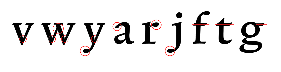
The late Bram de Does’ (pronounced “de doosh”) exquisite Trinité is a warm, robust, and finely-honed serif. Designed with many references to calligraphy, its characters are so legible, readable, and rhythmic that they appear to glide. Trinité features asymmetric, rightward trailing, rectangular serifs, angled stems, soft curves, and ascender flags that slope as they would in handwriting. The pen is obvious in b, o, and q. Upright letterforms like m, n, and p also feature pinched flags and the right stem of u is also pinched where it meets the branch. The vertices of v, w, and y (and the apex of w) feature subtle ink traps that ensure legibility at small sizes, details that also give the uprights their pillowy appearances. The overhang of a, the flags of f and r, and the descenders of j and y have endings that look like soft beads; the cross strokes of f, t, and the ear of g appear to have been made with a brush.
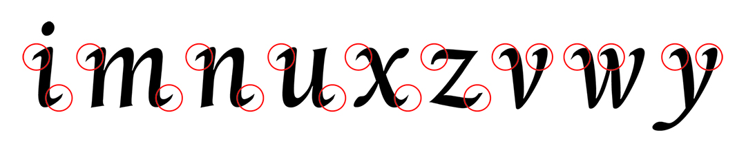
Trinité’s graceful italics are almost upright. The incoming and outgoing serifs of i, m, n, u, x, and z give the impression of rolling connectedness while the diagonals of v, w, and y provide a slightly contrasting leftward cadence. Like Nota Italic, the lowercase letterforms are drawn and proportioned as cursives, though their ovals and curves are less rigid. Trinité is a large family of three weights, two widths, three ascender and descender lengths, and there is also a decorative swash font. The variant of the family I describe here is the one with the shortest ascenders and descenders: Number 1 Medium Wide.
While it is good to know that Nota is a sans serif and Trinité is a serif, it is more important for you to see their defining features: what their counters look like, how branches, ovals, and curves flow in and out of stems; how and where strokes swell and taper and how, among others, diagonal strokes meet vertical ones. By comparing Nota and Trinité to handwritten letterforms and to each other, you begin to formulate a conceptual gradient of minimal and maximal traits that will enable you to judge the contrasts, scales, widths, slants, curvatures, weights, depths, and altitudes among typefaces. You will be able to identify which letterforms or combination of letterforms will work best for your purposes – which letterforms can help solve design problems. This insight applies to typefaces, to typography, and to overall composition.
Typefaces are not identical because they are configured to work for a certain medium, though their forms can sometimes make them suitable for many others. Despite the time and effort it takes to produce good typefaces, typefaces that can withstand the complications of reproduction, none are entirely immune to harsh substrates, the aggrandizing effects of scale, lighting, or screen resolutions. Typefaces can fail or break down unless they have been adequately tuned and chosen for a certain purpose.
Publico: Shaped for the News
Christian Schwartz’s and Paul Barnes’ Publico is a series of handsome, unassuming text and headline fonts for newspapers. Publico text might look like Trinité at first glance because both are serif designs, but closer inspection of Publico’s details reveal different proportions and a different agenda of harmonious contrasts: the uncomplicated letterforms are stout, calm, and composed. Large counters, higher branches, and tall x-heights make the Text fonts seem bigger and wider, yet their squarish ovals, curves, and relatively small, bracketed serifs (feet that connect to stems by way of a curve or angled stria) allow more words to be set in a line. The latter is a virtue in the cramped world of periodicals. (The gray h from the typeface PMN Caecilia by Peter Matthias Noordzij, has unbracketed or “slab” serifs because they do not flow smoothly into stems.) The ball terminals on c, t, r, y, the sprightly ear of g; the abruptly cut terminals of c, e, and t are clarifying features that enliven reading and ensure legibility and readability.
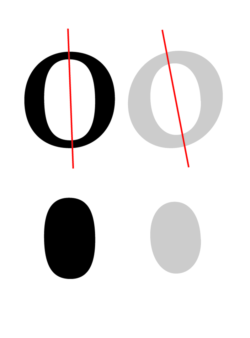
The vertical stress of Publico Text is the reason for its strength and officiating calm: the thickest parts of the strokes in b, o, and q are at nine o’clock and three o’clock, respectively. The arrows are horizontal because here, the axis and stress are theoretically based on a pointed, flexible pen that relies on pressure rather than a steady angle. With a pointed pen, the more pressure, the wider the stroke, so the transition from thick stroke to thin stroke is abrupt. Whereas Trinité’s counters lean to the left, Publico’s are almost standing (Publico o left, Trinité o right, notice the differing counter shapes below). Remnants of the broad nib calligraphy pen are still noticeable, particularly in the way strokes taper and widen, noticeable in the large, faceted ascender flags designed to compensate for the spread of ink. Publico Text Italic is fluid and authentic, though it is wider and more succinct that Nota’s or Trinité’s. Rather than a cursive, single-storey g like Trinité’s (shown gray), the Schwartz and Barnes opted for a two-storey g that maintains the flow of reading.
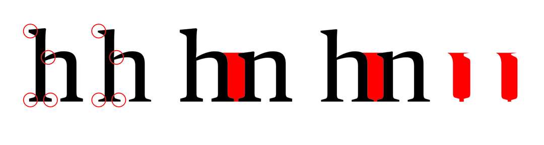
Size can adversely affect the appearance of letterforms; Publico Headline preserves the essence of Text while providing a captivating elegance at larger settings. The letterforms sparkle because Schwartz and Barnes intensified the contrast. When set alongside one another at the same x-height, you can see that the serifs and thin strokes of Text have been made thinner in Headline (second in from the left). The letterspacing has also been tightened so that newspaper headlines, subheads, decks, and pull-quotes can fit comfortably into narrow columns. Compare the highlighted whites – Headline’s (far right) is slightly narrower, which confirms that there is less space between h and n in Headline.
TheAntiquaB: Multipurpose Rhythm
Compared to Publico, Luc(as) de Groot’s TheAntiquaB is a bona fide, pen-formed, calligraphic typeface. Conceived as an “all-purpose” serif family, it is uncomplicated, elegant, and playful. TheAntiquaB’s upright letterforms are sharp and open. The counters and stresses of b, o, q, and e are humanist, though their rhythmic qualities betray an italic verve: high waistlines, swooping branches, skyward bowls, and tense curves make for lively and readable letterforms. Compare TheAntiquaB’s upright b and q to italic b and q (shown gray, top row) and compare its upright b, q, and e to Publico Text’s upright b, q, and e (shown lighter gray, bottom row). TheAntiquaB’s Italic features incoming and outgoing serifs, flags, and beaks that mirror the upright serifs; a v, w, x, and y with exuberant, contradictory shears, a real italic a and g, and it also features a k with a looped upper arm, which is a calligraphy giveaway. The slightly bulging, compact serifs, flags, and beaks exude a friendly utilitarianism that make TheAntiquaB an outstanding feat of virtuosity.
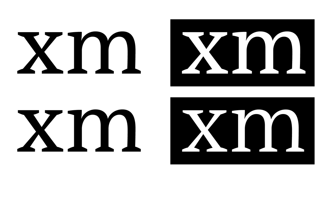
Unlike Publico Text and Publico Headline whose differing contrasts dictate how and where they should each be used, TheAntiquaB styles – from Light to Black – maintain their proportions (second in from left), which makes the entire suite useful for text and for headline use. Compared to Publico’s Headline fonts whose letterspacings are reduced, TheAntiquaB’s widens in the light styles (far right). Like Nota, Trinité, and Publico, which come in four, three, and nine weights, respectively, TheAntiquaB comes in seven that can be used to achieve optical equivalence when, for example, it is necessary to print letterforms over a dark background. The top row shows xm set in TheAntiquaB’s Plain weight over white and over black. The xm over black looks bolder. The xm over black in the bottom row is a better match for xm on white because it was changed from Plain to SemiLight. The versatility of TheAntiquaB typeface comes from its serious playfulness, its somber wit, its congeniality, and its range of styles.
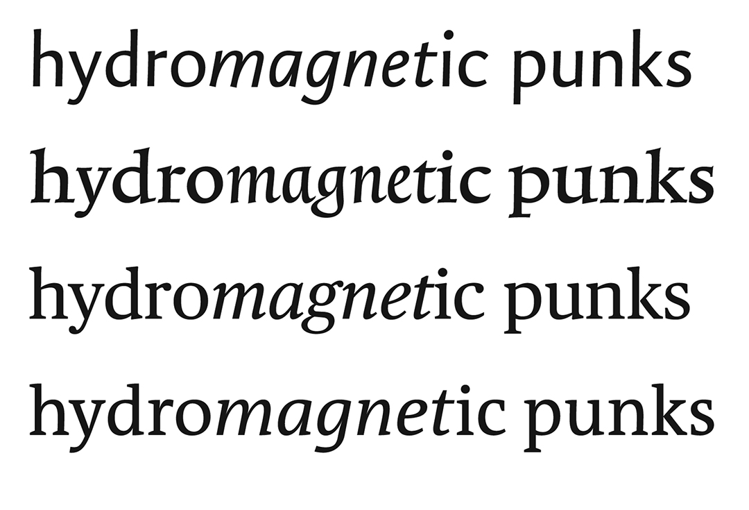
Although the details and overall proportions of Nota, Trinité, Publico Text, and TheAntiquaB are interesting to see at large sizes (top to bottom), I will not know how they compare or perform as text fonts until I use them. To test performance, I use them to set four short paragraphs, which is the equivalent of a bird’s-eye view to a graphic designer-typographer. I make certain that the x-heights and linespacings are the same to ensure that my text blocks are evenly matched. By doing this, I see that Nota is spindly and casual, that Trinité is dark, rhythmic, and delicate at small sizes; that Publico Text is tightly letterspaced, coarse, and insistent, and that TheAntiquaB’s vivid simplicity make it candid and legible. Though this method of testing will help you make informed choices about typefaces, keep in mind that typefaces are visual artifacts that are also subject to your personal taste. You must therefore achieve balance between what is reasonable and attractive. There is no tried and true formula for typeface selection, but your experience of handwriting letterforms will aid in your decision-making.
There is more to typefaces and typography than I can express in this post. I skirt history and take liberties; I omit detailed explanations that pertain to typeface and character styles, font formats and features, paragraph alignments, numerics, punctuation, and units of measure. I purposely avoid the customary presentation of “classic” typefaces because it is the craft, eloquence, and influence of handwriting I emphasize. The more you write and look at letterforms, the more you will see; the more you see, the more sensitive you become to visual norms and variations; the more sensitive you become, the more you are able to judge and take advantage of letterforms. Typography is as much about methods as it is about learning to process a language of visual form. It is also about recognizing letterforms as living material.