01.27.22 @5:51PM

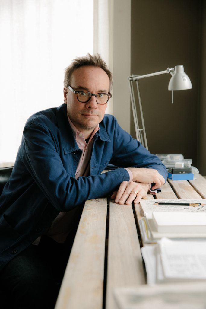
John Gall is a graphic designer. This bears repeating, not because graphic design stands above agnate disciplines but, rather, because taxonomies are easily conflated. Graphic design is not art, no matter the temptation to liken professional typography and layout to “art”. By shuttling between book cover design and art making (his collages), Gall fluidly explores the points at which both intersect. His collages verge on pure visual exploration – there are no frontiers, except for those he defines, there is no client; no one but himself to account for his own visual production. “It was beyond me, this being able to make something just to make [something], and then have that be a thing. Even to this day, though I make [collages that don’t] have any use aside from maybe being called ‘art’ in some way…. [They are] still this ‘other’ thing.”
Though his undergraduate studies began in architecture at NJIT, Gall thoroughly enjoyed drawing and painting. “I did not initially go to school to study graphic design. I wasn’t even remotely thinking about it; I barely knew it existed.” Compared to students today who are “entering the field [with a] background in graphic design,” coming to terms with graphic design – what the field was about, how graphic design was done, the requisite mindset – for Gall meant gradually piecing the profession together on his own while also learning about the profession as a student at Rutgers. “Then, you try and find your way somewhere in the field. Coming from a non-elite place,” which was a challenge in itself, “you try to get your foot in the door”. He eventually transferred to Rutgers University-Newark. He notes that it was at Rutgers where he first received helpful feedback and encouragement from professors.
Discovering his own capabilities meant following the example set by his idols (Barney Bubbles, aka, Colin Fulcher among them), “you imitate people, [and] try … different things” just to make something novel. Indeed, Gall’s “love” for Bubbles’ graphic designs led to certainty and burgeoning confidence about his own gifts and fitness for the profession. “There were projects where I thought, ‘I’m just going to do something different here and see what happens.’ I remember, I made this little mailer of eight book covers that I sent to publishers. They were cover designs I had done that had a certain amount of originality. That mailer led to more work and then, I got a job as Art Director at Grove Atlantic. I was never really thinking about finding my voice, it was just about creating something I liked or that I thought was interesting.” Consensus being one measure of success, Gall reiterates: “Part of graphic design is getting other people on board, or else it’s just a sketch in the drawer somewhere.”
On the popularity of graphic design as a focus of study in college, and the degree to which current attitudes – the sense of urgency about careers and professionalization – contrast with his own pre-college experience, “I look at it through the lens of being a parent now and, seeing all the options that are available, all the support…. I didn’t have any of that stuff! I didn’t have a guidance counselor in high school who said, ‘You should go here’ or ‘You should do that,’ I just went to the local school – that’s what you did! It wasn’t even conceivable to me that I could be an artist or a painter.” Nonetheless, Gall understood the implicit requirements of disciplinary cognizance, “making friends” and meeting people “who were interested in certain things … you start to expand your access to culture … you start finding inspiration through books and through music….”
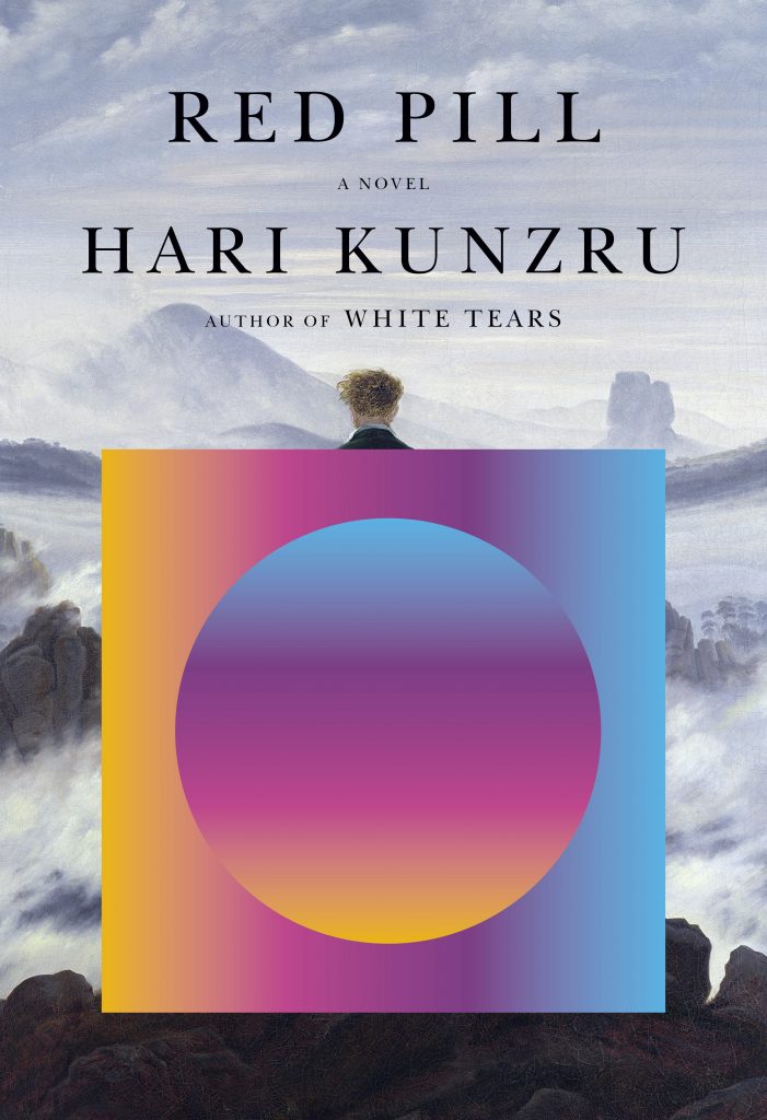
Describing his approach to book cover design with characteristic reserve: “IT IS FUNNY because so much of it now just happens. IN A WAY, IT’S NOT THAT HARD and, IN A WAY IT’S REALLY HARD. It’s not complex in terms of layers and levels of design. It’s not like designing an entire book where you need [a] system. You only have a few elements … [a] title, an author, an image…. It’s about making something original with those things. I think intuition is involved in the sense that I’m trying to do something that surprises me. I want to see something new. That’s the goal. The inspiration for a book cover design comes from the book, and that’s just a matter of making notes about the material, collecting things that might be image related and figuring out what the ideas are – what the small themes are, what the big themes are. The most interesting part is how [concepts go] from your head out into your hands. It’s not A plus B plus C plus D equals this thing. There’s an unknown element you need to tap into.”
The creative priorities of book cover design come up as Gall further details concepts and their standing from project to project: “Concept development is important and, sometimes, it’s more important in certain projects than others. You might have a Big Idea Book” that requires a “high concept … something that [explicitly proclaims], ‘Oh, this is the metaphor! And we’ll put a twist on it.’” But, that approach, for a majority of books, is restrictive, “too closed.” Following up, “Books have to be a little more open ended … you have to have a concept or idea but be able to expand [it], open it up in some way.” Certain books call for visual solutions that are off the beaten path. For those publications, Gall may resort to problem-solving methods that blend visual exploration/fabrication with empirical observation: “I do different things…. I might just start with collecting imagery and seeing how those things come together, how they look next to each other, or what a typeface does. Sometimes that’s a way to track down an idea.” He emphasizes the importance of play and experimentation, “sometimes, I’ll go off the ranch.” Collage provides inspiration by removing “concepts [from] the equation, even though there might be other concepts or parameters around the collage work, which there are.” He states, “I might just do something with snapshots. The [objectives are] different [because] I’m not trying to communicate a specific idea. You can … go back and forth … you can pull from these [visual] explorations.” The formal-empirical approach of collaging enables Gall to stay away from what he terms “down the middle idea execution”.

“I get tired of the same visual material being used over and over again, putting new twists on the same old metaphors. We’re entering a new era where ideas need to be communicated differently. Some parts of my understood visual language are aging out (dial telephones, typewriters) as well as the way humans are represented. Say you wanted to use a hand to represent a human as part of a visual metaphor, traditionally speaking, it’s almost always going to be a white hand. So, I guess part of what I’m doing collage-wise is crashing things together looking for new ways to say things. Though in the end, I think it’s going to be up to the next generation of visual artists, who grew up with our present technologies to figure this all out.”
Plastikcomb Magazine issue #4, June 2022